
Introducing the Arcjet Python SDK beta
The Arcjet Python SDK allows you to implement rate limiting, bot detection, email validation, and signup spam prevention in FastAPI and Flask style applications.
Framework switching, custom sidebar, custom table of contents, improved SEO, and a better user experience. How we customized Astro Starlight for the Arcjet docs.

Arcjet helps developers protect their apps against common attacks from bots, API abuse, form spam, and other security concerns. Developers tend not to be security experts, so our docs are particularly important.
Our docs serve as the cornerstone of our relationship with Arcjet users. This is where we explain the product and teach people how to integrate Arcjet’s security as code functionality like bot detection, PII detection, and email validation.
Developers visit the docs first, building on the initial sentiment they get from the website, blog, a conference, some social coverage or wherever they heard about us.
With the product being at its core a security SDK in the hands of developers, it is crucial that its documentation is reliable, comprehensive, dry and to the point, easy to access.
We are a small team and as such we need to carefully consider priorities. With content quality being our primary concern, our docs offer strong and developed functionality but are still visually WIP. No worries, we’ll get to that soon!
Life is complex, especially at the early-stage of an ambitious security product where everything needs to happen yesterday all while walking alongside companies with x4-5-6 times the scale.
So yes, we needed top-notch docs, but of course also had to develop the SDK, the Cloud API, manage incoming requests to our infrastructure, and give all this visibility through the web app, website, blog, etc.
What would be the best way to quickly create, serve and maintain a documentation resource with the smallest development overhead?
We initially started with Nextra, a docs framework for Next.js, because we already use Next.js for our app dashboard and website. However, we found it to be too inflexible and difficult to customize.
After some evaluation, we turned to Starlight: a needs-no-presentation, content-driven Astro docs framework, which is fast and convenient, with built-in search.
This has been a very flexible choice with virtually no friction in adoption, serving us well until recently. However, as our SDK started to add support for different frameworks, developing its functionality and increasing features, we realized that the docs structure was becoming defective and painful to work with.

This defective structure was due to the limitations of the default Starlight functionality combined with the anatomy of our product.
We found ourselves with individual pages (eg: Quick start, Reference and more) replicated for each framework we support, with only minor differences related to the specifics of the framework.
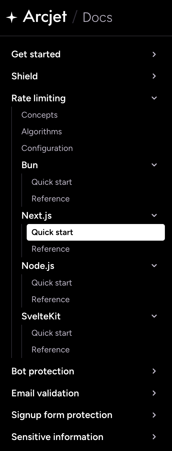
This created several pain-points with our docs implementation:
We also realized we had a few specific requirements that Starlight doesn’t offer out of the box like versioned documentation reflecting the SDK version and the ability to automatically generate code snippet variants without having to write them by hand (eg: .ts > .js)
We soon found out that we needed to customize our docs structure to tailor them to the particular requirements of our product. The goal was to keep the resource efficient on one side and control the maintenance overhead on the other.
We identified the following requirements:
To achieve the results above we had to implement a number of changes to our documentation architecture and the way it’s presented.
The bulk of the work was to rethink the architecture of the content. We essentially needed to manage multiple variants of the same pages across at least 2 dimensions – framework and language – and provide slick functionality to navigate through it.
A typical example would be the Quick start page for one of our primitives, this can be considered a single resource, eg: Features / Rate limiting / Quick start but has 8 different permutations when taking into account framework and code language:
| Language | ||
|---|---|---|
| Framework | Node.js / TS | Node.js / JS |
| Next.js / TS | Next.js / JS | |
| Bun / TS | Bun / JS | |
| SvelteKit / TS | SvelteKit / JS |
The goal was to conceptually create a single page, which could then serve variants based on a preference of framework, language and any other dimension necessary. We needed to adapt to the user choice, so this had to involve client-side interaction.
Unfortunately, Starlight doesn’t provide a built-in way to handle this type of scenario, which is to some degree specific to multi-platform products like Arcjet.
However Astro does provide a way to add dynamic content to pages by using Astro Islands. We found we could use this to unpack the power of a dynamic framework like React surgically, to switch portions of the page content on demand:
Defining islands architecture:
The general idea of an “Islands” architecture is deceptively simple: render HTML pages on the server, and inject placeholders or slots around highly dynamic regions [...] that can then be "hydrated" on the client into small self-contained widgets, reusing their server-rendered initial HTML.
So we created a number of utility React components that would handle this conditional hydration along with their UI switcher counterparts.
Switchers are a crucial element of navigating content this way and as such they need to be promptly available in order to effectively define the affordances of the page. We added them in multiple locations:
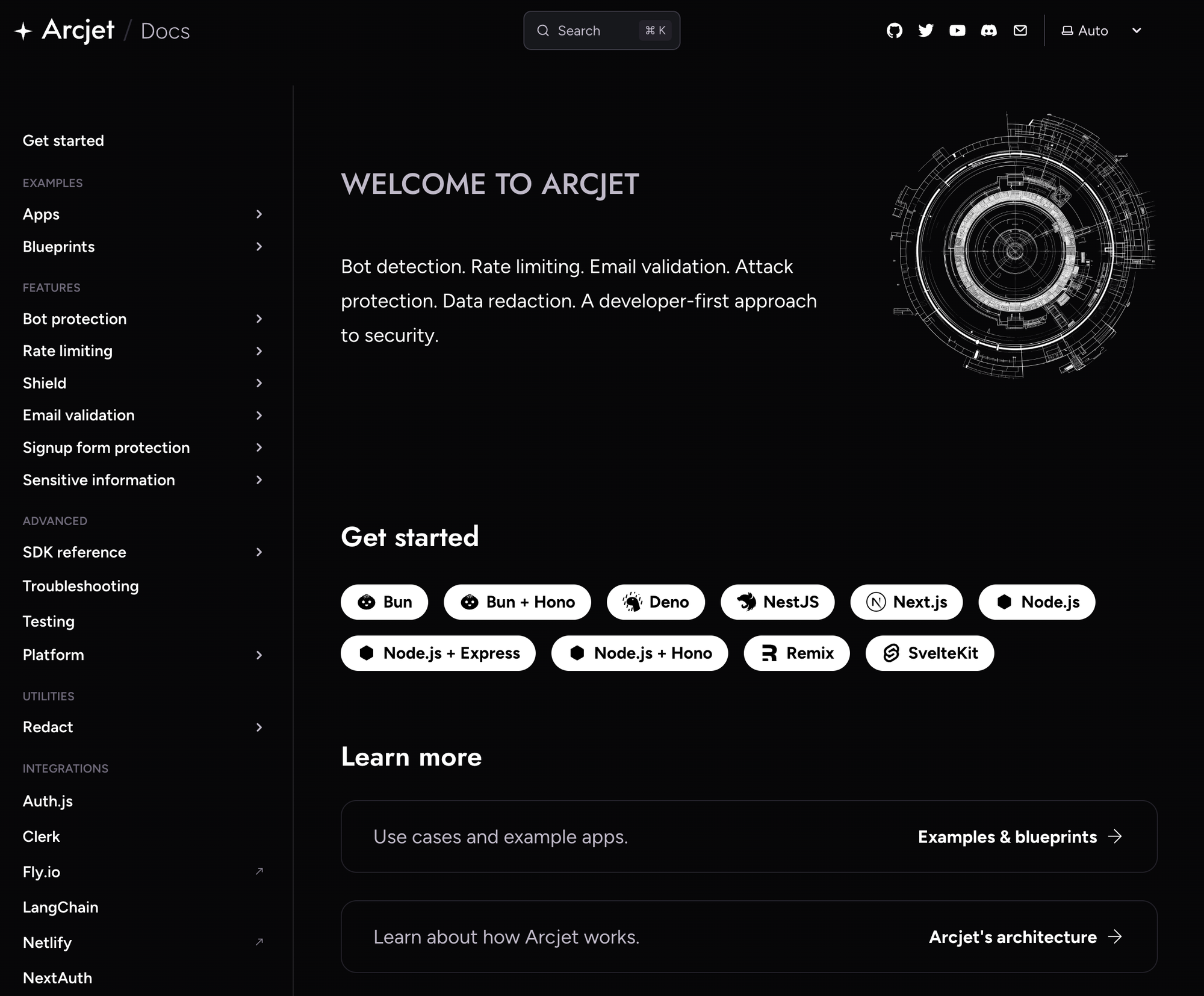
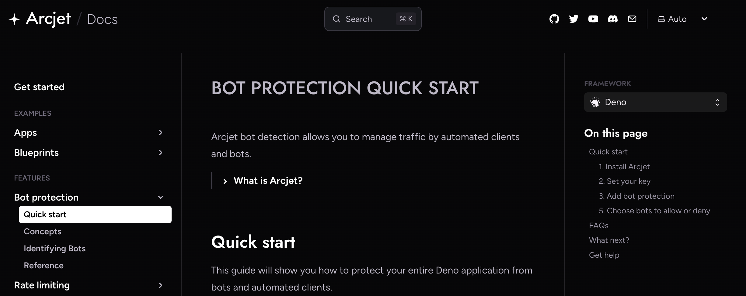
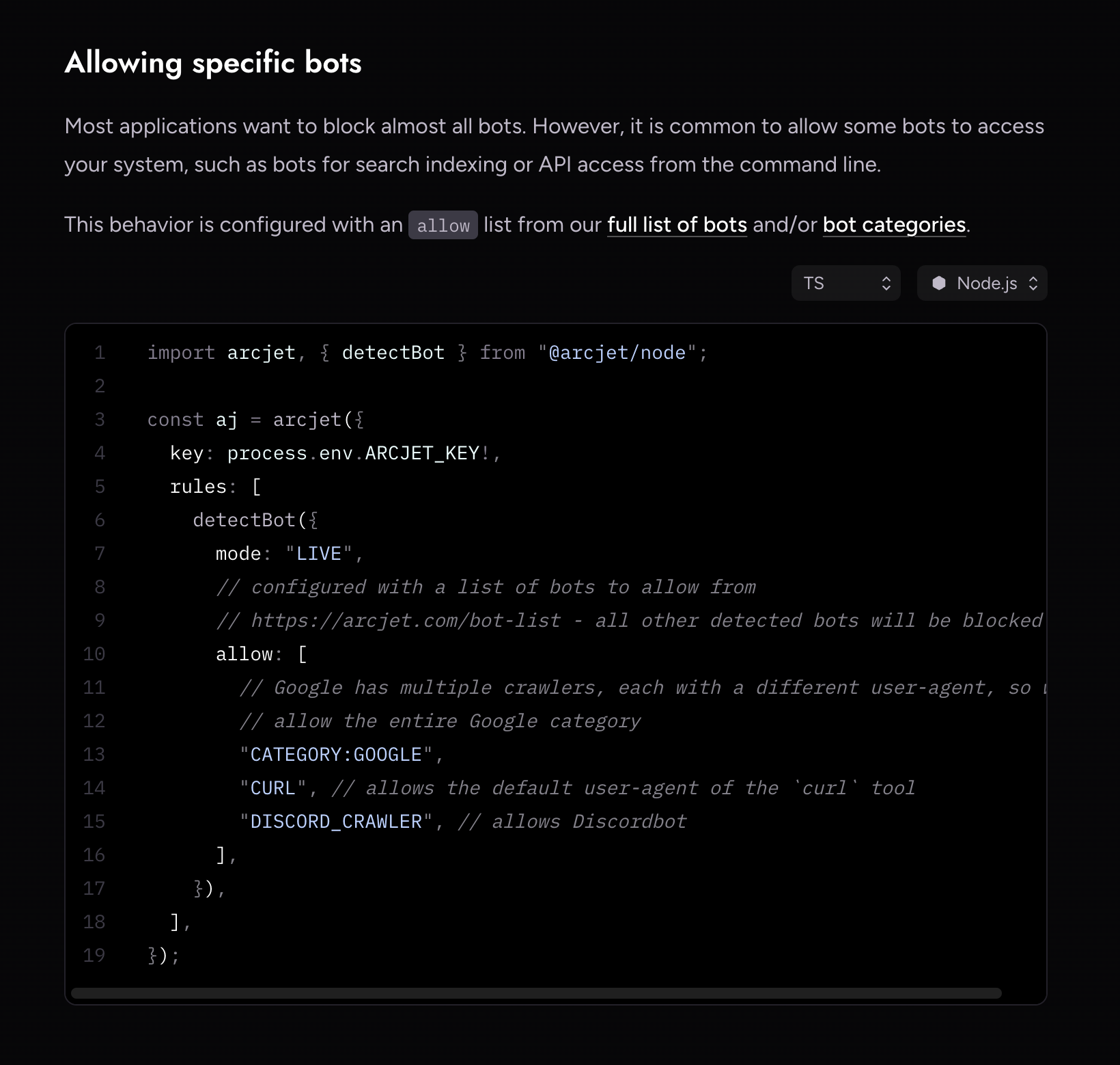
Under the hood, the switchers would be informed by the page MDX frontmatter describing which frameworks to make available:
---
title: "Get started with Arcjet"
description: "Getting started with Arcjet. Quick start guide to protect your app from attacks, apply a rate limit, and prevent bots from accessing your NestJS, Next.js, Node.js, Bun, or SvelteKit app."
frameworks:
  - bun
  - bun-hono
  - deno
  - nest-js
  - next-js
  - node-js
  - node-js-express
  - node-js-hono
  - remix
  - sveltekit
---
Custom mdx frontmatter defining the available frameworks for this page.
With just a small addition to the Starlight docs collection schema:
import type { FrameworkKey } from "@/lib/prefs";
import { docsSchema } from "@astrojs/starlight/schema";
import { defineCollection, z } from "astro:content";

export const collections = {
  docs: defineCollection({
    schema: docsSchema({
      extend: z.object({
        frameworks: z.custom<FrameworkKey[]>().optional(), // Our addition
        pageTitle: z.custom<{ [key in FrameworkKey]: string }>().optional(),
      }),
    }),
  }),
};
This allowed us to provide a wrapper around framework specific .mdx or .astro components that would execute the content switching.
### 3. Add a rate limit to a route

The example below applies a token bucket rate limit rule to a route where we
identify the user based on their ID e.g. if they are logged in. The bucket is
configured with a maximum capacity of 10 tokens and refills by 5 tokens every
10 seconds. Each request consumes 5 tokens.

<SlotByFramework client:load>
  <BunStep3 slot="bun" />
  <NextJsStep3 slot="next-js" />
  <NodeJsStep3 slot="node-js" />
  <SvelteKitStep3 slot="sveltekit" />
</SlotByFramework>

<SlotByFramework client:load>
  <BunStep4 slot="bun" />
  <NextJsStep4 slot="next-js" />
  <NodeJsStep4 slot="node-js" />
  <SvelteKitStep4 slot="sveltekit" />
</SlotByFramework>
Our custom framework component.
Then for each framework we get further down the tree based on language and/or other dimensions:
import Step3TS from "./Step3.ts?raw";
import Step3JS from "./Step3.js?raw";
import { Code } from "@astrojs/starlight/components";
import SelectableContent from "@/components/SelectableContent";

<SelectableContent client:load syncKey="language" frameworkSwitcher>
  <div slot="TS" slotIdx="1">

    <Code code={Step3TS} lang="ts" title="index.ts" />

  </div>
  <div slot="JS" slotIdx="2">

    <Code code={Step3JS} lang="js" title="index.js" />

  </div>
</SelectableContent>
Selecting code based on language.
This allows us to have N dimensions without having to manually create pages for each individual permutation – which could easily get out of hand – but deal only with the chunks that are necessarily different.
Of course the devil’s in the details so there were a number of extras to iron-out, such as persisting prefs in local storage for returning users, making page variants individually linkable through URL parameters, and so on.
This was a more interesting gotcha – making each (and all) islands aware of (and reactive to) a preference update. This is where we discovered that context providers won’t work with the partial hydration provided by Astro’s client:* directives.
The use case for state management here is pretty simple so a quick dive into Nano Stores provided the solution.
Define the store:
import { atom } from "nanostores";

import type { Framework, FrameworkKey } from "./lib/prefs";
import { defaultSelectedFramework, frameworks } from "./lib/prefs";

export const displayedFramework = atom<FrameworkKey>(defaultSelectedFramework);
export const queryParamFramework = atom<FrameworkKey | undefined>();
export const availableFrameworks = atom<Array<Framework>>(frameworks);
store.ts
Manage it in components:
import Select from "@/components/Select";
import {
  availableFrameworks,
  displayedFramework,
  queryParamFramework,
} from "@/store";
import { useStore } from "@nanostores/react";
import { useEffect } from "react";

const FrameworkSwitcher = (...) => {
  ...

  const $availableFrameworks = useStore(availableFrameworks);
  const $displayedFramework = useStore(displayedFramework);
  const $queryParamFramework = useStore(queryParamFramework);

  const onChange = (e: ChangeEvent<HTMLSelectElement>) => {
    ...

    displayedFramework.set(val);
  };

  useEffect(() => {
    ...

    availableFrameworks.set(val);
  }, []);

  return <Select ... />;
}
FrameworkSwitcher.tsx
import type { FrameworkKey } from "@/lib/prefs";
import { displayedFramework } from "@/store";
import { useStore } from "@nanostores/react";
import { useEffect, useState } from "react";


const SlotByFramework = (...) => {
  ...

  const $displayedFramework = useStore(displayedFramework);
  const [selectedFramework, setSelectedFramework] = useState<FrameworkKey>();

  useEffect(() => {
    setSelectedFramework($displayedFramework);
  }, [$displayedFramework]);

  // return Slot for selectedFramework
};
SlotByFramework.tsx
We didn’t change the previous content configuration so we still leverage content collections as per the default Starlight theme.
Astro 4 introduced a new experimental content layer API which is stabilizing in Astro 5 so we could move the content out to a CMS or other system.
However, there is something elegant about having content all in MDX located in the same GitHub repository. Our docs are open source and we can take advantage of the workflow tooling GitHub provides like diffs, comments, pull requests, etc.
For the code samples, we maintain a custom snippets/ folder inside the site src/ which is the bucket for all individual code samples.
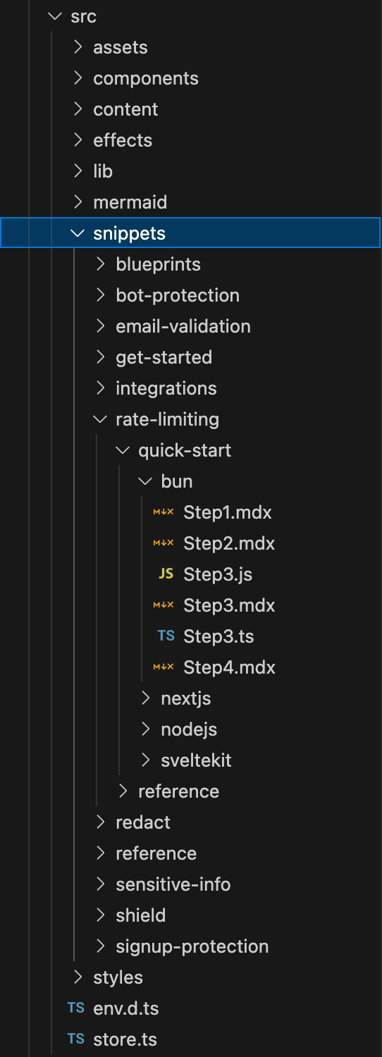
Each code sample is an actual language file wrapped by – imported in – the .mdx that is served by the framework aware islands. This has the advantage of allowing us to treat them as real code.
One of the most annoying things when reading docs is code samples that don’t work, so this helps us ensure that the code is at least syntactically correct and conforms to all the types we import. Being able to use the LSP features of our editor really helps!
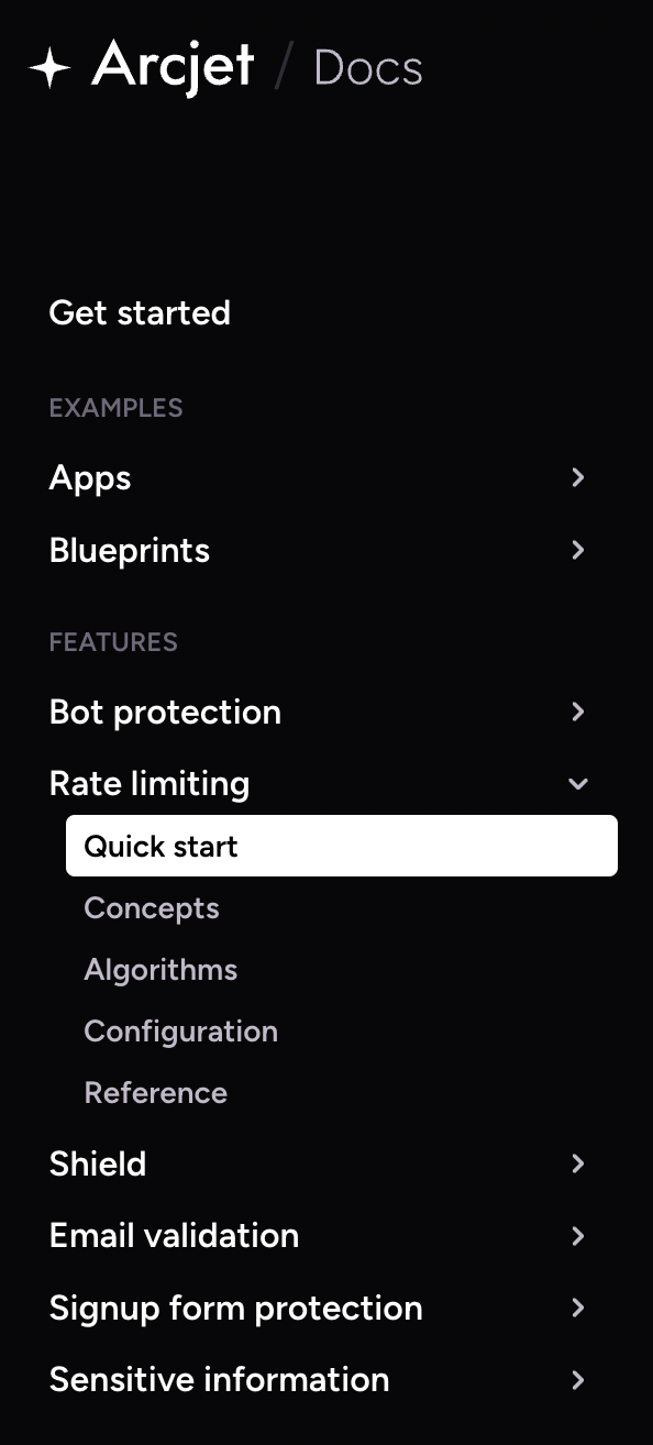
Adapting the site sidebar to the new content architecture was the natural next step. This would become the blueprint of our documentation structure - the users’ compass. We had to move away from the generic multi-purpose nesting provided by Starlight:
Level 1 > Level 2 > … > Page
And show a custom, more structured, hierarchy:
Section > Topic > Page
This was easy enough to achieve using built-in Starlight functionality. We created a <Sidebar /> component override for the default theme sidebar component to namespace everything with .aj-sidebar.
---
import SidebarLinks from "@/components/SidebarLinks.astro";
import Default from "@astrojs/starlight/components/Sidebar.astro";
import type { Props } from "@astrojs/starlight/props";
---

<div class="aj-sidebar">
  <Default {...Astro.props}>
    <slot />
  </Default>
  <SidebarLinks />
</div>
components/overrides/Sidebar.astro
We’ve then created a custom sidebar definition with additional attributes that would help specialize the appearance of the different sidebar levels.
export const main = [
  ...
  {
    label: "Integrations",
    collapsed: false,
    items: [
      {
        label: "Auth.js",
        link: "/integrations/authjs",
      },
      {
        label: "Clerk",
        link: "/integrations/clerk",
      },
      {
        label: "Fly.io",
        link: "https://fly.io/docs/reference/arcjet/",
        attrs: { target: "_blank", class: "external-link" },
      },
	...
    ],
  },
  ...
];
Our original sidebar vs the new one – goodbye redundancy!
We faced some additional complexity when handling each page’s Table of Contents widget in the right sidebar. If the page content can transform based on the selected framework, then its titles can too.
However the change of content happens on the client, whereas the standard Starlight theme TOC is generated at build time, which means it would fall out of sync at each framework selection.
To fix the above and have a state-synced sidebar we had to create a custom <PageSidebar /> component override, replicating all the TOC functionality.
Since the Starlight TOC has no knowledge of the different titles available in the .mdx content and hydrated by the different islands, we extended the docs collection schema with a custom TOC object definition. This can be used in each page’s frontmatter:
import type { FrameworkKey } from "@/lib/prefs";
import { docsSchema } from "@astrojs/starlight/schema";
import { defineCollection, z } from "astro:content";

export type TocNode = {
  text: string;
  anchor: string;
  framework: FrameworkKey | FrameworkKey[];
  children: TocNode[];
};

export const collections = {
  docs: defineCollection({
    schema: docsSchema({
      extend: z.object({
        ajToc: z.custom<TocNode[]>(), // Our addition
        frameworks: z.custom<FrameworkKey[]>().optional(),
        pageTitle: z.custom<{ [key in FrameworkKey]: string }>().optional(),
      }),
    }),
  }),
};
---
title: "Rate limiting"
description: "Quick start guide for adding Arcjet rate limiting to your Next.js, Node.js, Bun, or SvelteKit app."
frameworks:
- bun
- next-js
- node-js
- sveltekit
ajToc:
- text: "Video quick start"
anchor: "video-quick-start"
framework: "next-js"
- text: "Quick start"
anchor: "quick-start"
children:
- text: 1. Install Arcjet
anchor: "1-install-arcjet"
- text: 2. Set your key
anchor: "2-set-your-key"
- text: 3. Add a rate limit to a route
anchor: "3-add-a-rate-limit-to-a-route"
- text: 4. Start server
anchor: "4-start-server"
framework: ["bun", "node-js"]
- text: 4. Start app
anchor: "4-start-app"
framework: ["next-js", "sveltekit"]
- text: "FAQs"
anchor: "faqs"
- text: "What next?"
anchor: "what-next"
- text: "Get help"
anchor: "get-help"
---With this approach we can describe framework specific titles, so that the TOC can change and stay consistent with the content.
We shipped the changes a few weeks ago and how’s this new life?
Users can navigate entirely within their framework of choice:
Navigating the Arcjet docs by framework.
MDX looks neat, less maintenance burden == fewer mistakes: the following page describes all framework and code variants (!!!) for our “Get started” page: https://raw.githubusercontent.com/arcjet/arcjet-docs/refs/heads/main/src/content/docs/get-started.mdx
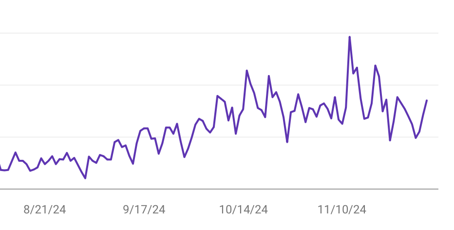
Business benefits, we’re seeing an increase in search traffic now we just have a single version of each doc page.
See our docs live and check their functionality.

One of the requirements for restructuring the docs was to introduce versioning into our docs to match the SDK version.
There is no simple way to implement docs versions in Starlight. Our first attempts were file-based, either with custom code and with plugins such as Starlight Versions, but we came to the conclusion that branch versioning will probably prove a more robust and easy to maintain approach.
We have a number of updates in store for the look and feel of the docs. The goal is to smooth out the UX on one side while better directing users in and out of the docs and through other Arcjet online resources on the other.
We consider the Arcjet docs to be part of the product, so there's always more to do!

The Arcjet Python SDK allows you to implement rate limiting, bot detection, email validation, and signup spam prevention in FastAPI and Flask style applications.

The tech stack behind Arcjet: WebAssembly runtimes, a Go gRPC decision API, and region-aware SNS→SQS→ClickHouse pipeline.

Arcjet’s mission is to help developers and security teams build with confidence, no matter where they work or what frameworks they choose. As
Get the full posts by email every week.